As Adrian William has grown, our branding has grown with it. What began as a business rooted in the Inner West has expanded into the Inner City, carrying that same standard into new pockets of Sydney. Our identity has evolved to match. The thinking behind it hasn't changed, but the way we express it has.
The refresh, in short: across our signboards, sold and leasing stickers, A-frames and social templates, pink steps forward as a feature colour, and our signature handwriting takes on greater prominence.
Pink has always been part of our palette, though it has never had a moment quite like this. The shade is drawn from the facade of our flagship Newtown office, a heritage-listed 1930s Art Deco building on King Street that once housed a Commonwealth Bank branch. Restored within a fixed, period-appropriate colour scheme, the building's pink exterior nods to a colour long synonymous with the Art Deco era, sitting comfortably against our black-and-white corporate identity.
The shade first had its moment in the spotlight last October, when we used it across our signboards for Breast Cancer Awareness Month, raising funds for Chris O'Brien Lifehouse. The response from our community was immediate. It told us this colour had earned a bigger, more permanent place in how we present ourselves.
Our General Manager, Leilani Shephard, explains: "Bringing pink into the Adrian William brand was a natural evolutionary step. It's soft enough to work well with what Sydney already knows us for, but bold enough to differentiate us in a sea of monochrome.”
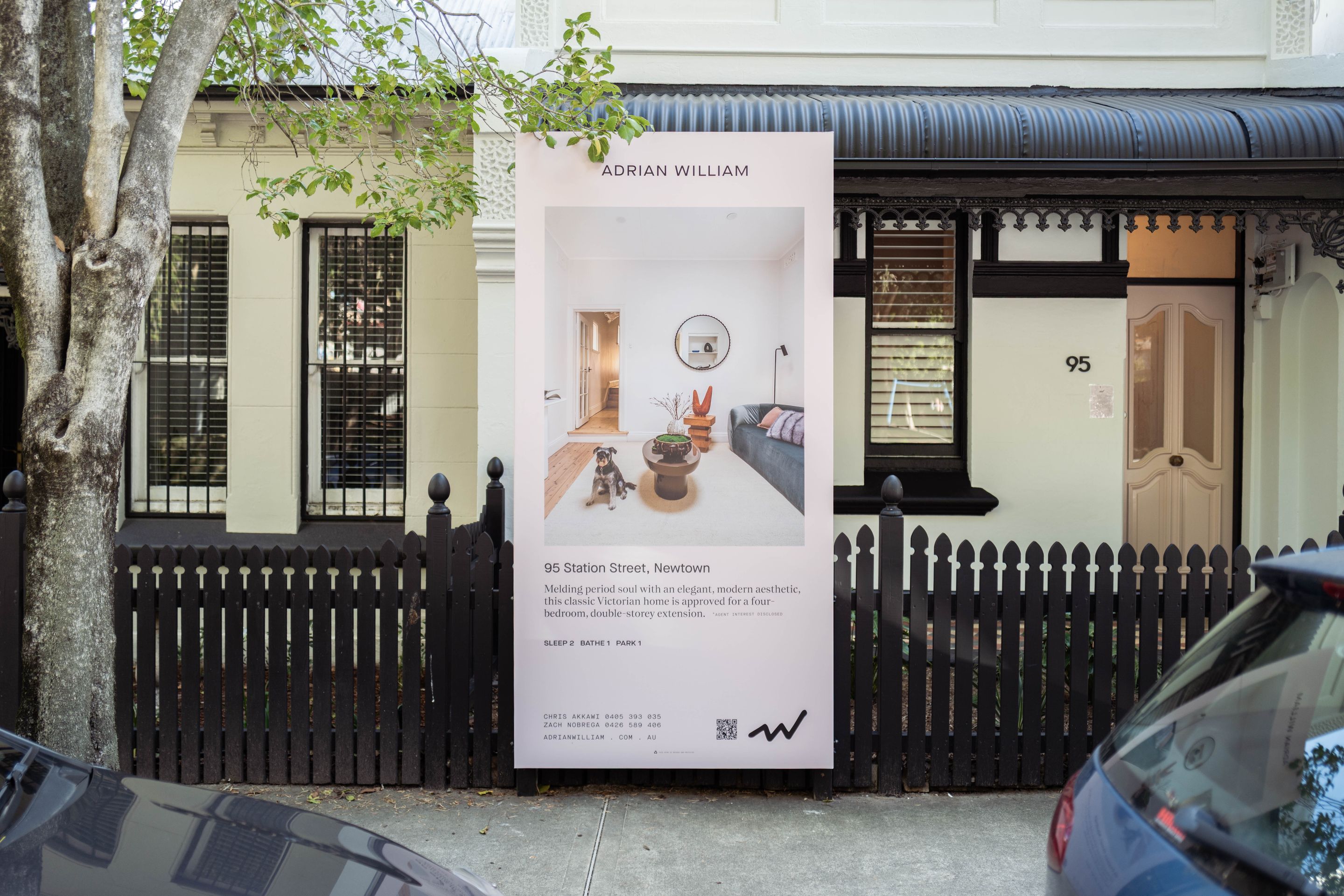
Handwriting has also taken on a more prominent role, appearing on agent names and on the words we choose to highlight. Our designer, Lyndal Harris of September Design Studio, points out: "It's actually not a font at all. It's custom lettering, created fresh every time we make something." Every mark traces back to our original signature – a monogram formed from the letters A and W.
Our brand has grown alongside us in other ways, too. Our earliest offices wore bold, graphic murals across their windows, a look that suited where we were at the time. As the business has matured, so has that visual language. Harris describes the wider shift as a move from street art to fine art. "Those murals have made way for something more curated, more sophisticated," she says. "We brought a fine art team in, and every piece across the office has been chosen with real intention."
This refresh is the same story our brand has always told: grounded in the Inner West, and growing into new spaces, without ever losing sight of where we began.
We hope you love it as much as we do.